This is my concept phase for our Rock Paper Scissors project, below is my 10 thumbnails I sketched in my grid book.

The first 4 thumbnails are more of a generic template with the header at the top with pictures aligned with it. The next 3 are more of a landscaped template with the header more to the right so it wouldn't take too much space, the last one of the three has more of a corner pattern. The last 3 are more different and i actually like them more. The headers are going down vertically along the right and left side, I even tried out it going down the center. The last one was a long shot, didn't really like the way it ended out.
The next pictures are sample images I got from google and the reason behind me choosing them is they are very clean with a black and white template going on.

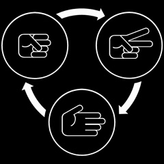


I really liked the first three, my one main problem with the last one is the arrows are a kinda yellowish/green color and would much rather have it being black or white. In my sample template I used the 2nd and 3rd picture just because the 1st one was a little to large to put in.

This is my sample template, using the 8th thumbnail I sketched out. I really like how the header worked out looking, one thing i would change is less text, I feel there is just way to much.
I like thumbnail sketches numbers 8 and 10 because each is very different and unique. However i think number 10 would be even better because I think it will break things up even more and focus attention most on the text and pictures rather than the header. Your sample really has me focusing mostly on the header.
ReplyDeleteI like your final design. Maybe a little wordy but all-in-all pretty awesome.
ReplyDeleteI really like the rough draft that you have created. It looks really pleasing to the eye. I do agree that you should try to fit in that long image right underneath the header to kind of set the tone for the rest of the poster guide.
ReplyDeleteI would experiment using the 6th template with your "become a master" graphic. It seems like the graphic would fit well with the header and you could also do something cool with the border
ReplyDeleteI have honestly never seen anything quite like design number 10. The header going down the middle is so bizarre, it's awesome. It would look much better when executed full-size and the the blend of pictures and text mesh well together.
ReplyDeleteif you can pull it off, then yea 6 could be brilliant. choice is very important in which images are used there.
ReplyDeleteI like the look of template number 4, the boarder use gives it a newspaper like look, I think it looks very official.
ReplyDeleteIf you decide to use #10, first off I think it's very unique. I think to make it even more eye-catching, you should put the intro and rules in opposite corners and fill the empty corners with images. The cross to the header doesn't have to be an image either, you could just make it some fancy design.
ReplyDelete