Tuesday, December 10, 2013

Final


These two art works are champions from league of legends that I made from scratch in adobe illustrator both combined took me roughly over 10 hours to outline and color. The colors and themes are not in the game and I mostly just made them up.


This pixel art has no real context and I did it mostly for fun. It took me around 5 hour to complete


Thursday, November 7, 2013

Wk11 Maze Texturing Concept phase

These are the three images I am going to use for references for my level design. This is from Valve's Portal 2 and is considered to have one of the best level designs of any game ever made. Portal 2 is also one of my favorite games so this was not to hard to choose which game to get references from.


Tuesday, November 5, 2013

Wk10 Maya Model Final Phase


These are my two final screenshots of my maze. I think it turned out pretty well. On purpose I did not put in any light besides the ambient blue lighting. I think that makes it look a lot more like an ice maze rather than just a regular one. I did have one problem with the object snap in Maya which made this a little more difficult, but overall it went well. 

Tuesday, October 29, 2013

Wk09 Maze Design Final Phase


This is the final phase of my maze and it turned out pretty average. I think i might go back and change the back wall to the icy textures i used for the right and left side. other than that it came out alright.

Thursday, October 24, 2013

Maze Research Phase

                              Easy                                                                Medium

Hard

Thursday, October 17, 2013

Wk08 Building/Structure Concept Phase


So this is a concept image from google that I am using for my building and structure project. Since my game is based in the arctic mountains their really is not many buildings that I could use. So with an igloo i'm going to use the entrance and the snow for use of shadowing and texturing.

Wk07 Pixel Prop Final


Tuesday, October 15, 2013

Wk07 Research phase


My game is probably not going to have a lot of pixel art, if any, so i made a high res pixel image of a hammer that I will most likely use. It did not come out as I wanted due to the high res.

Thursday, October 3, 2013

Wk06 Game logo research

In my dot grid book are my 4 main concepts for the logo design. Below are pictures I might use for the icicles in illustrator. I'm leaning more towards the 1st or 4th one, if I even use the 2nd or 3rd I would add in the icicles at the bottom. 
 

Wk 05 Title Screen Final Phase


Tuesday, September 24, 2013

Wk04 Mood Board Final Phase

Background / Cinematic Examples


These are just a few examples of what I want the background of the game to be. It's going to be a little difficult not to make it boring due to the lack of colors. Every color is just a different shade of white and blue. 


Character Examples

This character originates from Super Smash Bros: Melee. This is one of the Ice Climbers and gives a really good idea of what I want in the main character of my game. The Ice Climbers are little children with big hammers dressed like they were in the arctics, just like I would like my Character to look like. However, I am planning on making my character a little older, maybe in his early teens. 

Monday, September 16, 2013

Wk03 Game Pitch Final Phase


So below is my art concept of the weapon, to the right is my drawing scanned out of the dot grid book and the left is when i traced over is in illustrator. 


Wednesday, September 11, 2013

Wk03 Game Pitch Concept Phase

My concept for my game is a 2d plat-former based in the arctic mountains. The beginning of the game starts with a cinematic of a family living in the mountains, showing how they live, how they interact with each other. Eventually an avalanche occurs separating the son from his family. Determined to be united with his family, the boy goes through levels through the mountain fighting creatures and going through obstacles.

The game is highly influenced by the game Super Meat Boy


I feel the hardest part about the artistic style would be to make the environment not boring. Being set in the mountains its mostly going to be white, with snow surrounding everything. I'm going to need to make it not boring with everything being white.


The first weapon the main character is going to get is going to be an icy mallet that he pulls out of the debris after the avalanche. The idea of the mallet comes from the art of "frozen mallet" in league of legends.


Monday, September 9, 2013

Wk02 Rock, Paper, Scissors Final Phase

This is my final concept phase of the rock, paper, scissors project for this week. This template strings from my 10th thumbnail, which originally, I didn't like as much as the 4th or 8th one, but after putting it in PS I ended up liking it more. I feel the title really catches your eyes and each side has a color theme to it.

The left side has a black theme to it, using one of the images I had originally but switching the colors around and making the arrows black with the paint tool.

The right side has a white theme to it, and the top image needed a lot of editing. I put a white outline to the original image and reversed the colors so its white hands with black outlines instead of the opposite.

I also found a different picture online with both of the colored hands at the bottom. I cropped out some random texts and serrated both of the 3 hands to put on both sides.


Below is the other idea I had that I originally was going to go with, but ended up not. Also another image I found online that I used.


Thursday, September 5, 2013

Wk02 Rock, Paper, Scissors Concept Phase


This is my concept phase for our Rock Paper Scissors project, below is my 10 thumbnails I sketched in my grid book.


The first 4 thumbnails are more of a generic template with the header at the top with pictures aligned with it. The next 3 are more of a landscaped template with the header more to the right so it wouldn't take too much space, the last one of the three has more of a corner pattern. The last 3 are more different and i actually like them more. The headers are going down vertically along the right and left side, I even tried out it going down the center. The last one was a long shot, didn't really like the way it ended out.

The next pictures are sample images I got from google and the reason behind me choosing them is they are very clean with a black and white template going on. 


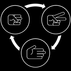
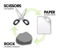
I really liked the first three, my one main problem with the last one is the arrows are a kinda yellowish/green color and would much rather have it being black or white. In my sample template I used the 2nd and 3rd picture just because the 1st one was a little to large to put in.


This is my sample template, using the 8th thumbnail I sketched out. I really like how the header worked out looking, one thing i would change is less text, I feel there is just way to much.